Causes of income inequality since 1947.
Does L. Bartels' graph of income growth in the different quintiles as a function of Republican vs. Democratic control of the presidency demonstrate a fundamental causative mechanism?
First, look at the Census graph of Gini coefficient (measure of inequality) versus time. This shows inequality decreasing till about 1970, then increasing. The increase was not reversed during the Carter and Clinton administrations, and earlier Republican administrations were not significantly off-trend either.
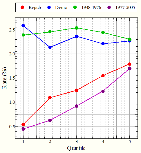
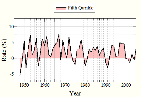
Second, here is a plot of average income growth quintiles a la Bartels, but done in two ways: a) as Bartels did it, by party in control of the White House; and b) simply by time - before 1977 and after. (Data from the Census. The Fifth Quintile is actually the lower limit of the top 5 percent.)
Plotting by time or era obviously gives a better separation than by party. The division was made at 1977 simply because it gives an equal number of years for each era - moving it one way or the other would not change things much.
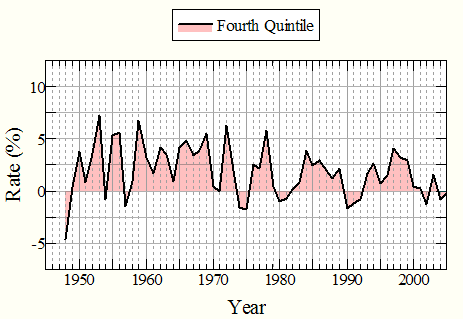
Third, look at the data for each quintile as a function of year. Here is the year-over-year change in upper bounds of family income quintiles. (Same data from the Census)
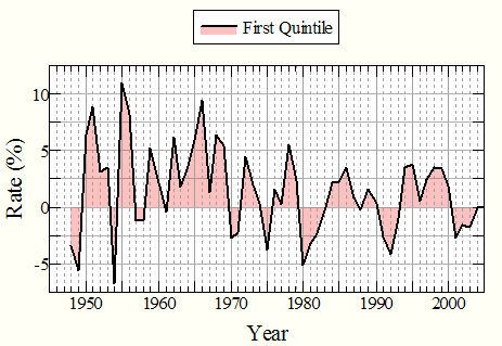
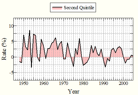

The lowest and highest quintiles combined:
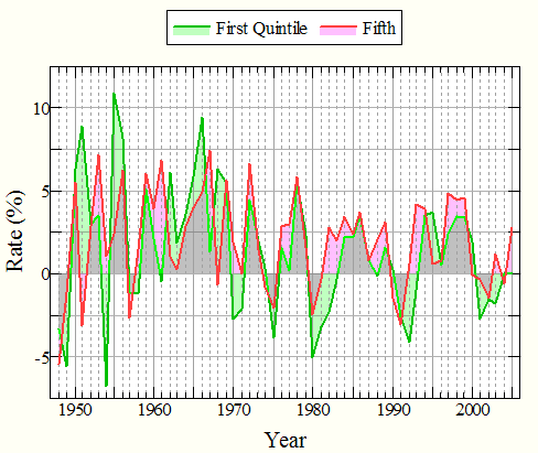
Gray areas show overlap of the growth for both quintiles. The many green areas above zero before about 1970 indicate strong growth for the lowest quintile. Upper quintiles also grew but not as much. After 1970, the predominance of red above the line and green below the line indicates that the upper quintile was gaining and the lower quintile was losing.
Growth was higher overall in the 1948-1977 period, and more so for the lower quintiles. The highest growth rate for the lowest quintile (and for all quintiles) actually came in the Eisenhower administration. This higher growth, especially in the 60's, weights Bartels' graph in favor of Democrats.
The Clinton administration had the best income growth in the later period, but inequality was even greater than in the Reagan-Bush period (see the Census graph)
The lower quintiles took the brunt of recessions after 1969. Upper quintiles recovered distinctly faster from recessions.
Consider the two hypotheses: a) that income growth and inequality are turned on and off as if by a switch when control of the White House changes parties; and b) patterns of income growth changed gradually over time as conditions and/or overall economic philosophy and policies changed.
We simply do not see hypothesis a) in the Census graph or the graphs of income growth versus time above. Hypothesis b) is consistent with all views of the data; Bartels' interpretation a) appears only in the graph of quintile versus growth, but even in this graph the separation by time is more impressive.
There is nothing new in the data, or in Bartels' analysis by presidential party - the reasons for lower growth and higher inequality after the 60's have been debated for a long time. Other data considered in light of the two hypotheses would very likely give similar results, as the underlying basis in time is the same.
The lack of real evidence that presidents have month-to-month control of the economy does not mean that there is no difference in economic policies between the parties. The later period is one in which conservative or Republican economic philosophies and policies have dominated, and economic performance has clearly not been as good as in the earlier period - there would be no discussion if there were not a major difference.
04/10/08